
Designing an Explainable AI Dashboard for Infrastructure Risk
Asset Risk Monitor transforms opaque AI risk scores into transparent, actionable intelligence — helping operators understand why a system is flagged, not just that it is.

infrastructure monitoring?
Urban infrastructure systems — power grids, water pipelines, transportation networks, industrial equipment — are undergoing a shift from reactive to predictive maintenance. Advances in sensor technology and machine learning have made it possible to estimate asset failure probability before failure occurs. But this shift introduces a new operational challenge: the gap between algorithmic prediction and human action.
Monitoring systems now surface risk scores generated by models whose reasoning is opaque to the operators who must act on them. The literature on human-automation interaction (Lee & See, 2004; Parasuraman & Riley, 1997) consistently identifies this opacity as a trust calibration failure — not a technology problem, but a design problem.
How can Explainable AI (XAI) principles improve transparency, trust, and operational decision-making in infrastructure monitoring dashboards?
By surfacing contributing factors, confidence levels, inspection history, and recommended actions, a well-designed XAI interface enables operators to achieve calibrated trust — acting decisively when evidence warrants it, and appropriately cautiously when it does not.
Infrastructure systems — pipelines, electrical substations, industrial equipment, utility networks — operate continuously, carry public-safety consequences, and generate sensor data at a scale no operator can manually process. Organisations managing these systems increasingly rely on ML-driven platforms to surface risk intelligence. But adding algorithmic prediction to a monitoring workflow introduces a new problem: operators must now act on recommendations they did not produce and cannot fully interrogate.
Asset Risk Monitor is a conceptual product that addresses one question: what does a monitoring interface look like when it treats AI-generated risk assessments as claims to be justified, rather than facts to be displayed? It applies Explainable AI (XAI) principles across a five-screen product system, giving infrastructure operators the information they need to understand, evaluate, and act on algorithmic risk assessments — with confidence proportional to the evidence available.
The design draws on published research in human-automation interaction (Parasuraman & Riley, 1997; Lee & See, 2004) and AI explainability theory (Miller, 2019). These are not cited as credentials — they are the active constraints that shaped every layout, copy, and information architecture decision in the project.
a trust deficit — by design
Most infrastructure monitoring platforms were architected before ML-generated risk scores existed. Their information structures were designed for human-triggered, rule-based alerts with transparent provenance: a sensor threshold was exceeded, therefore an alarm fired. When algorithmic assessments are layered onto these architectures, a fundamental mismatch emerges. The platform was not designed to explain its reasoning because the original system did not have reasoning. It had rules.
Lee & See (2004) characterise this as a trust calibration failure: operators who cannot inspect the basis for an automated recommendation will either over-trust it (complying without judgment) or under-trust it (dismissing without consideration). Both outcomes are operationally worse than a well-designed system with no AI at all — because they introduce a new failure mode without providing the tools to manage it.
Inspection records, sensor streams, maintenance histories, and asset metadata are stored across disconnected systems. Building a complete picture of a single asset's health requires 20–30 minutes of manual cross-referencing across 3–5 tools. Under time pressure — the conditions under which accurate information matters most — this process degrades or gets skipped entirely.
When an ML model produces risk score 73 for asset TRF-4821, that number is the output of a calculation involving dozens of signals with non-obvious weights. Without contributing factors, confidence level, and analysis recency, the operator has no basis for judgment — and no basis for explaining their response to a supervisor, auditor, or regulator if questioned.
UX design is the translation layer between algorithmic output and human judgment. A well-designed interface that surfaces contributing factors, confidence intervals, inspection history, and recommended actions in operational language enables calibrated trust — acting decisively when the evidence warrants it, and appropriately cautiously when it does not. The design does not need to make operators into data scientists. It needs to give them enough to decide.
Parasuraman & Riley (1997) established that automation misuse — over-reliance and disuse — stems from a mismatch between an operator's mental model of a system and its actual behaviour. Miller (2019) extends this to AI explainability, arguing that explanations are useful not when technically complete, but when contrastive (why this outcome rather than another?), selective (focused on the most influential factors), and expressed in the user's domain vocabulary. All three properties are implemented in the Risk Explanation screen's design.
and where they fall short
A heuristic evaluation of four established monitoring platforms — applying Nielsen's 10 usability heuristics with particular focus on Visibility of System Status, Recognition Over Recall, and Error Prevention — revealed consistent failure patterns at the intersection of AI-generated content and operator decision needs. These platforms are not poorly designed in absolute terms; they fail specifically as contexts for exercising human judgment over algorithmic recommendations.
The evaluation applied Nielsen's heuristics with specific attention to three most relevant to operator decision support: (1) Visibility of System Status — do operators always know what the AI is doing and why?; (2) Recognition Over Recall — is information presented rather than requiring users to remember it from other tools?; and (3) Error Prevention — does the interface make incorrect operator actions structurally difficult? All four existing platforms show critical violations on at least two of these three heuristics when AI-generated content is involved.
cadences. One platform.
Designing for multiple stakeholders requires explicit tradeoffs: the information density, update frequency, and interaction model appropriate for an operator's second-by-second shift is actively wrong for a manager's quarterly planning session. The three profiles below drove the IA and the decision to build structurally distinct views for operational and executive users — rather than a single configurable dashboard that would serve neither well.
Detect and triage emerging risks across the asset network in real time, under the time pressure and cognitive load of a continuous monitoring shift. Respond to alerts before they escalate — and be able to explain every response decision to a supervisor.
"Is this alert worth escalating, and why exactly is this asset flagged?"
Needs portfolio awareness in <10 seconds without scrolling. AI reasoning must be visible from the asset screen without additional navigation. Every extra interaction adds latency that is operationally consequential.
Conduct physical inspections on assets prioritised by risk level, with enough contextual information — contributing factors, condition history, what signals to look for — to produce a high-quality inspection record without consulting a separate system on-site.
"Which asset should I inspect first, and what specifically should I examine when I get there?"
The Inspection Planner must surface a risk-sorted queue by default. Correct prioritisation must be the system's default state — not a filter the inspector must remember to apply before starting their shift.
Allocate maintenance budgets and inspection capacity across a large portfolio efficiently. Communicate infrastructure risk posture to executive leadership with quantified evidence. Make proactive investment decisions before high-risk trends become high-cost failures.
"Is our risk position improving over time, and where should we invest maintenance resources next quarter?"
Real-time sensor data is noise for this user. The Executive Dashboard deliberately excludes it. A 9-month rolling trend window was selected because quarterly planning cycles are the relevant decision cadence — not a shorter timescale that would obscure trend direction.
documented decision rationale
Designing for infrastructure risk required developing domain fluency before any interface work began. The process was governed by one constraint: every design decision must be traceable to either a user need, a research finding, or an alternative that was explicitly considered and rejected. This produced a slower process and a more defensible outcome — which, in a graduate portfolio context, is the correct tradeoff.
Defined the challenge as a trust calibration problem. Reviewed OSIsoft PI Vision, IBM Maximo, Bentley AssetWise. Applied Nielsen's heuristics with focus on AI-specific failure modes.
Defined the conceptual asset schema and risk formula before any layout work. Mapped every field to a UI element. Confirmed that fields without a UI mapping were either excluded or deferred.
Structured the platform as 5 modules with explicit primary questions. Evaluated and rejected two alternatives: single configurable dashboard (transfers IA burden to user) and role-based views without shared navigation (fragments the workflow).
Mapped above-the-fold content for each screen. Evaluated three overview layout alternatives. Selected the two-column structure with persistent alert feed after comparing against alternatives on the time-to-first-insight criterion.
Designed the core workflow: alert → asset → explanation → work order. Applied a ≤2-click rule for critical insights. Mapped all navigation paths to verify zero dead ends and no context-loss points.
Built semantic colour tokens (red/amber/green consistent across all 5 screens), typographic hierarchy, and a component library — KPI cards, gauges, factor bars, table rows — designed for consistency and scalability.
infrastructure monitoring today
Each problem below is framed using Nielsen's usability heuristics — enabling precise diagnosis and a direct mapping to the design response. Describing problems precisely is a discipline: vague problem statements produce vague solutions. Heuristic framing forces specificity.
Risk scores surface without contributing factors, confidence levels, or source attribution. Operators cannot form a mental model of how the system produced its output — violating the requirement that users always know what the system is doing and why. The consequence is a trust calibration failure: operators who cannot inspect AI reasoning will over-comply or dismiss, both of which degrade safety outcomes more than having no AI at all.
Inspection histories, maintenance logs, and sensor readings are stored across disconnected systems. Operators must recall which tool holds which data type and mentally synthesise results — a recall-heavy process that takes 20–30 minutes per asset under non-urgent conditions and gets skipped under time pressure, precisely when accuracy matters most.
Monitoring platforms surface risk data but provide no mechanism for translating it into prioritised maintenance workflows. Without a risk-sorted queue, operators under time pressure default to chronological scheduling or personal judgment — systematic prioritisation errors that the heuristic of error prevention requires good design to prevent structurally, not procedurally.
Monitoring and maintenance operations are separate product concerns requiring operators to export from a monitoring tool and re-enter into a work management system. This creates handoff points where tasks are routinely dropped, delayed, or duplicated — and removes user control from a task that should be a single continuous workflow.
Never the reverse.
Before any screen layout was sketched, the conceptual asset data model was defined. This is a discipline, not a formality: designing dashboard visualisations without understanding the data they represent produces interfaces that look informative but cannot be built, or that visualise fields with no operational meaning. Every field in the schema below has a corresponding UI element — or it was removed.
= Failure Probability × Asset Criticality
= 0.71 × 0.92 → 73 / 100 (HIGH)
The formula is intentionally simple. Its purpose is to establish a principled, auditable basis for the score — not to model all failure physics. The design principle: if a formula cannot be explained to an operator in one sentence, it is a trust liability, not a trust asset.
risk_score: 73factors[]model_confidencecondition_scoreexplicit acceptance criteria
Design goals are only useful when specific enough to evaluate decisions against and reject features that don't serve them. Each goal below is stated as a requirement with a measurable acceptance criterion — not as a value ("we want clarity") but as a testable condition.
Acceptance criterion: An operator must be able to read the contributing factors, confidence level, data source breadth, and analysis recency for any risk classification — without querying the underlying model, consulting a data analyst, or leaving the current screen. The explanation must use the operator's domain vocabulary (insulation degradation, pressure variance), not the model's (feature weights, SHAP values). If an operator cannot explain a risk classification to their supervisor using only what the interface shows them, the goal is not met.
Acceptance criterion: A trained operator opening the overview must be able to answer "where do I need to focus right now?" before scrolling. Above-the-fold content must include: total asset count by risk level, active alert count with timestamps, pending inspection count, and geographic risk distribution. Time-to-first-insight on the overview is the primary usability metric; every layout iteration was evaluated against it.
Acceptance criterion: Starting from the overview, an operator must be able to: identify a high-risk asset (1), review its risk explanation (2), and assign an inspection team with a work order (3) — without leaving the platform or switching tools. Each additional handoff point is a statistically significant source of task abandonment and delay in operational environments; the 3-interaction ceiling is a patient-safety-class constraint, not a UX preference.
One connected workflow.
Each screen was designed to answer one primary question — and evaluated against that question as its acceptance criterion throughout the process. The screens form a deliberate workflow arc: situational awareness → asset diagnosis → AI interpretation → operational response → strategic oversight. Every navigation path follows this arc; none require backtracking or context-switching.
Primary question: Where do I need to focus right now?
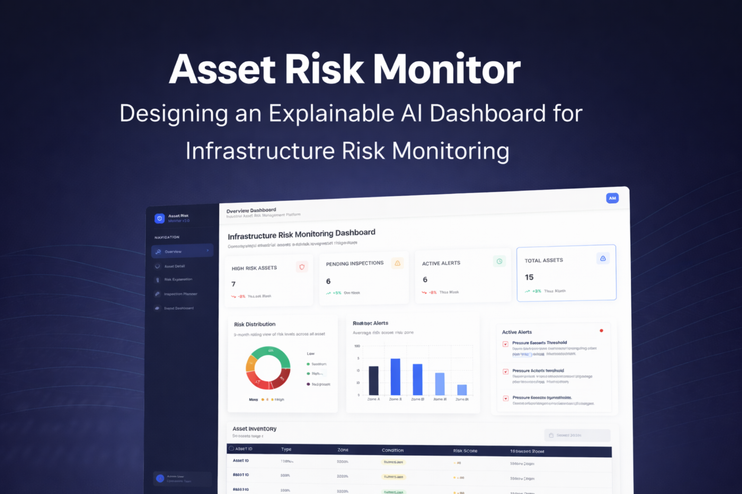
The overview is built around a triage hierarchy, not a data inventory. KPI cards surface system-level counts — 7 high-risk assets, 6 active alerts, 6 pending inspections, 15 total assets — with week-over-week delta indicators enabling operators to assess whether the situation is stable or deteriorating without asset-level navigation. The risk distribution donut converts count data to proportional data — a cognitively distinct representation that supports the portfolio-health judgment ("40% of assets are Critical" reads differently than "6 assets are Critical"). The zone comparison chart enables geographic triage. The live alert feed sits in a persistent right column — competing for attention with the chart data rather than subordinated to it — because time-sensitive alerts must not be visually deprioritised relative to non-urgent summary charts.

The 4-cell KPI row answers the situation assessment question in <10 seconds. Delta indicators (↓2%, ↑5%) support a second-order question: is the trajectory improving or worsening? Operators who see "High Risk: 7, ↓2%" adopt a meaningfully different response posture than those who see "7, ↑5%."
Donut chart converts count to proportion data. "40% of assets are Low risk" supports a portfolio-health judgment that "6 assets are Low risk" does not. The four-segment semantic encoding (green/amber/orange/red) maps directly to the colour system used across all five screens, reducing per-screen visual learning.
"Pressure Exceeds Threshold — AST-009 — 5 hrs ago" carries more urgency than the risk distribution chart. The alert feed occupies a persistent right column so time-sensitive alerts compete visually with non-urgent chart data — not hidden in a dismissible panel that operators must remember to check.
Primary question: Why is this asset flagged, and what is its current physical state?
The asset detail consolidates three categories of information an operator needs to form a response decision: composite risk assessment (gauge), physical condition context (condition score 62/100), and factor-level explanation (contributors chart). The two-column layout places gauge and recommendation in visual proximity so cause and response are always read together — never separately. The contributing factors chart uses horizontal bars rather than a pie chart (which obscures ranking), a vertical bar chart (which requires rotated labels), or a plain list (which provides no magnitude encoding). The bar length encodes relative influence; the rank order encodes decision priority; the label text uses the operator's domain vocabulary, not statistical terminology.

Risk score (73%) and condition score (62/100) are shown side-by-side because they answer different questions. Risk reflects future failure probability weighted by criticality; condition reflects past physical state from the last inspection. An asset can score high on one and low on the other — the appropriate maintenance response differs significantly in each case.
Horizontal orientation was selected after evaluating three alternatives. Bars are ranked highest influence first — a non-negotiable constraint because operators will act on the first-listed factor before reading further. Insulation Degradation as the lead factor tells the operator precisely where to target their intervention.
88% confidence paired with "based on historical patterns, sensor data, and maintenance logs" provides two trust signals: certainty level and evidentiary breadth. A high-confidence score derived from one recent reading warrants different operator skepticism than one built on 3 years of multi-source data — and the interface surfaces that difference.
to be justified, not facts
The Risk Explanation screen is the product's most novel design — and its hardest to get right. The failure mode is obvious: showing too much information produces cognitive overload; showing too little produces the same opacity problem as the systems this platform is intended to improve.
The design is grounded in Miller's (2019) three properties of operationally useful AI explanations: contrastive (why this classification rather than another?), selective (the most influential factors, not all model inputs), and social (expressed in the user's operational vocabulary, not the model's statistical vocabulary). Each design choice on this screen implements one of these three properties.
Transaction Velocity Spike at 92% tells the operator this specific signal pushed the classification to HIGH — not "there are several concerning factors." The contrast is the explanation.
The model may use 20+ inputs internally. Showing only the top 5 implements Miller's selectivity principle — more factors reduce comprehension without improving decision quality. The interface omits factors below the influence threshold.
"Freeze outgoing transfers and initiate MFA challenge within 30 minutes" is an instruction an operator can execute. "Feature weight 0.92 exceeds threshold at 2.1σ" is not. The translation from model output to operational language is where UX writing generates its value in AI products.
"Last analysed · 2 minutes ago" communicates staleness — a dimension of data quality invisible in the risk score itself. An operator reading a 73% score needs to know whether it was calculated 2 minutes or 6 hours ago before deciding how urgently to respond.

Primary question: Which assets should be inspected, by whom, and when?
The Inspection Planner's core design principle: correct prioritisation must be the default state — not a filter the operator must remember to apply. Risk-sorted order means the highest-priority action (inspect PL-2041-A, score 92) is visible on load with no configuration. This is a deliberate departure from the chronological default ordering used in most CMMS systems, which encodes a scheduling assumption (when was it last inspected?) rather than a risk assumption (which is most likely to fail?). The "Unassigned" state is displayed as muted gray text rather than an empty cell — creating mild cognitive friction that draws attention to the gap without alarming operators about assets pending assignment for legitimate scheduling reasons. The Work Order CTA is positioned at the module level, not within individual rows, to support bulk creation for multiple assets in a single action.

Sorting by risk score rather than date or asset ID encodes a normative claim: the highest-risk asset should always be inspected first. This removes the class of prioritisation errors introduced when operators under cognitive load default to the most convenient scheduling order — directly addressing the error prevention heuristic violation identified in the competitive analysis.
An empty cell would be less visible than "Unassigned" in gray. A Critical asset that is unassigned is an incomplete decision, not a neutral state — and the interface should make that visible. Muted text creates enough friction to notice the gap without triggering alarm for non-critical unassigned assets lower in the queue.
Positioned at the module header rather than embedded in individual rows to support a realistic operator workflow: after a shift's risk review, an operator may need to generate work orders for 3–4 assets simultaneously. Row-level CTAs would require 3–4 separate interactions for what is, operationally, one decision.
Primary question: Is our infrastructure risk position improving over time, and where are the systemic vulnerabilities?
The Executive Dashboard is architecturally distinct from the operator screens — not a simplified version of the overview, but a screen organised around a different decision cadence entirely. Operations managers do not need to know that AST-004 is at 82% today; they need to know whether the organisation's aggregate risk position is improving over the past three quarters, and which asset categories are carrying disproportionate risk. The 9-month rolling trend window was selected specifically because quarterly planning cycles are the relevant decision cadence — a shorter window would obscure trend direction; a longer window would suppress recent changes. The Executive Insights panel translates metric changes into plain-language conclusions, completing the final interpretation step that most BI dashboards leave to the viewer.

Nine months captures three full quarterly planning cycles. A 30-day view is too short to reveal trend direction; a 24-month view would suppress recent inflection points. The timescale was sized to the decision cadence it supports — quarterly budget allocation — not to the data available or a default dashboard convention.
Endpoints contributing 38% of critical findings is not just a monitoring observation — presented to a budget committee, it is a resource allocation recommendation with quantified justification. The stacked bar chart is the only screen element that directly enables a capital investment argument without additional analysis.
"Critical risks decreased 25%" and "Cloud posture improving steadily" are the outputs an operations manager needs for a board presentation — not the underlying numbers that produced them. The insights panel completes the interpretation step that most dashboards leave open, where the viewer must perform the final synthesis themselves under time pressure.
open research questions
This project establishes a design framework for explainable AI in infrastructure monitoring. Several directions remain for future research and development — each representing a meaningful extension of the work rather than a minor enhancement.
The design was developed without access to real infrastructure operators. A structured usability study — measuring task completion time, error rate, and NASA-TLX cognitive workload scores before and after introducing the XAI interface — would validate or challenge the core design assumptions. This is the most important next step.
The current design uses a conceptual data model. Validating it against real sensor data — from open infrastructure datasets such as those published by Smart Cities initiatives or utility regulators — would reveal whether the schema covers the necessary fields and whether the visualisation choices hold up with realistic data distributions.
A controlled experiment comparing operator decision quality with and without the XAI explanation interface — using Lee & See's (2004) trust calibration framework as the measurement instrument — would produce publishable findings on the UX mechanisms that most effectively improve human-AI collaboration in operational settings.
Field inspectors access the system on-site, under environmental constraints (sun glare, gloved hands, split attention) that the current desktop-first design does not address. A mobile-first inspection tool — with offline capability, simplified data entry, and a stripped-down risk context view — would extend the platform's utility to the field team user role.
The current Inspection Planner surfaces risk-prioritised queues for reactive scheduling. A natural extension would be a proactive scheduling engine that uses the risk model to recommend inspection dates before assets reach critical thresholds — moving the platform from reactive risk response to preventive risk management.
The visual design system uses semantic colour coding (red/amber/green) that relies entirely on hue to convey status — a known accessibility failure for colour-blind users (affecting approximately 8% of male operators). A full WCAG 2.1 AA audit and icon-based redundant encoding system would ensure the interface meets regulatory and ethical accessibility standards.
each decision traceable to evidence
The platform addresses all four identified failure patterns. Each solution element maps to a specific problem, a specific user need, a specific research finding, and a specific design decision that was evaluated against at least one alternative before being selected.
Implements Miller's (2019) three properties of useful AI explanation — contrastive, selective, and social — through ranked factor bars, confidence scoring with signal count, and operationally-phrased recommended actions. Any operator can read the evidence behind any risk classification and explain their response to a supervisor without leaving the screen or consulting additional tools.
Five screens with five explicit primary questions, ordered from low to high information density. The overview displays ~6 data elements. The asset detail ~14. The explanation screen ~20. Cognitive load increases only as operational need for detail increases — never ahead of it. This architecture was evaluated against a single-screen configurable alternative and rejected because configurability transfers the information architecture burden to the user.
Alert → asset → explanation → work order is completable in ≤3 interactions — meeting the design goal and eliminating the cross-system handoff points where operational tasks are routinely dropped. The decision to integrate monitoring and operations in a single product was the highest-leverage architectural choice in the project — and the most frequently absent feature in the competitive platforms reviewed.
and measurable in production
Each outcome maps to a specific design decision. In a production context, each would be measured against a pre-deployment baseline using task-time analysis, error rate tracking, and operator workload surveys calibrated to the NASA-TLX scale — the standard instrument for cognitive load measurement in operational HCI research.
The above-the-fold KPI row, risk distribution chart, and zone comparison reduce time-to-situational-awareness to <10 seconds on load — versus an estimated 3–5 minutes of cross-tool assembly in fragmented environments. Design decision responsible: strict above-the-fold content discipline during wireframing, evaluated at every iteration against the <10-second acceptance criterion.
Risk-default ordering in the Inspection Planner removes the prioritisation errors introduced when operators under cognitive load default to chronological or manual scheduling. Design decision responsible: deliberately departing from the CMMS industry's chronological-default convention, justified by the error prevention heuristic and confirmed by the competitive analysis finding that no reviewed platform enforced correct prioritisation structurally.
Contributing factor transparency, confidence scoring with signal count, source attribution, and analysis timestamp give operators the information required for calibrated trust — the specific outcome Lee & See (2004) identify as the mechanism by which automated systems produce safe operational behaviour. Design decision responsible: framing the explanation screen as an evidence interface rather than a data display, which produced a different set of content requirements than a conventional "AI panel."
Progressive disclosure, semantic colour consistency across all 5 screens, and plain-language recommended actions collectively reduce the working memory demands placed on operators. Design decision responsible: the "one primary question per screen" constraint established during IA, which forced the removal of individually useful features (inspection history charts, sensor time-series) that served secondary questions and belonged on a different screen or a future version.
about designing for AI systems
Designing for AI-assisted decision-making in a high-stakes operational domain surfaced challenges absent from consumer product work. Each learning below is drawn from a specific design decision that was made, reconsidered, and revised — not from reflection after the fact.
The hardest decisions on the Risk Explanation screen were not about where to place a chart. They were about what information is necessary and sufficient for an operator to form a reliable judgment. Reading Miller (2019) changed the framing from "how do I display these model outputs?" to "what does an operator need in order to evaluate this claim?" That reframing produced a better screen than any layout iteration could have — because it changed what the design was trying to accomplish.
Early in the project I asked "what data should I visualise?" rather than "what decision does this visualisation need to support?" The 9-month trend chart timescale was not chosen because 9 months of data was available — it was chosen because quarterly planning cycles are the relevant decision cadence. Designing dashboards from the data outward produces technically complete but operationally irrelevant interfaces. Starting from the decision and working backward to the minimum data required produces the opposite.
The temptation in enterprise dashboard design is to include everything relevant on every screen. The discipline is in assigning each screen one primary question and removing features that serve secondary questions — even individually useful ones. Inspection history charts, sensor time-series, and asset comparison views were all removed from screens where they appeared. Each one belonged on a different screen or a future version. Scope discipline at the screen level is what makes a system feel coherent at the product level.
Building the Inspection Planner (operations) into the same platform as the monitoring screens — rather than treating them as separate product concerns — was the highest-leverage decision in the project. It did not require complex visual design. It required recognising that monitoring and operations are not separate workflows but two phases of one workflow. The best design decisions in enterprise systems are often invisible in the final interface and central to its utility.
The question is not whether to show a risk score. It is whether to show the thinking behind it. Every AI system that withholds its reasoning from the people who act on it is asking those people to trust without understanding — and that is not a design oversight. It is a design choice.
to elevate your digital presence?
I specialise in UI, prototyping, usability testing, and research to craft compelling user experiences.
Selected Works
Asset Risk MonitorConceptual Project- Independent Research Project

Save HandsResponsive Website

Filmy BotTicket Booking APP

TrottRedesign

Tax AgiesTax Filing Company